

Fault Lines & Front Lines is a geospatial analysis portfolio built for TSA's (Technology Student Association) Geospatial Technology event, whose 2024–2025 theme asked teams to identify a disaster threat facing their community. Our team (King County, Washington) focused on seismic risk: King County sits in the Pacific Ring of Fire, within the Puget Sound region, either near or on top of several faults - the Seattle Fault, the Tacoma Fault, and the Cascadia Subduction Zone - and is flanked by active volcanoes like Mount Rainier and Mount Baker. The 2001 magnitude-6.8 Nisqually earthquake is the most recent reminder of that exposure.
We pulled fault line, liquefaction, floodplain, bridge-condition, unreinforced masonry building, and emergency-services data from sources like the USGS Earthquake Catalog, King County GIS Open Data, Seattle GeoData, and Esri's federal fault datasets, then combined and overlaid it in eight analysis maps to identify Seattle's highest-risk zones and inform evacuation and shelter-in-place guidance.
Seattle is the most populous city in Washington, and its residents face outsized risk in a major earthquake: dense downtown neighborhoods sit close to the Seattle Fault, over a thousand unreinforced masonry (URM) buildings predate 1945 and were never secured to code, and roughly 2,000 miles of underground wastewater pipeline crisscross known fault zones. Emergency planning needed a way to see where fault activity, unstable soil, vulnerable buildings, and critical infrastructure actually overlap - not just where earthquakes have historically been recorded.
- Source data came from many different public portals (USGS, King County GIS, Seattle GeoData, FEMA, Esri) with inconsistent formats and no single unified schema.
- The Seattle population density dataset alone held ~27,000 census-block records - too dense to render as a single readable map.
- Findings had to be communicated to non-technical judges and the public through a written analysis and infographic, not just raw maps.
- Earthquake location, timing, and magnitude are fundamentally unpredictable - any "prediction" had to be framed as a probabilistic estimate, not a forecast.
Averaging historical epicenters to model a plausible future earthquake
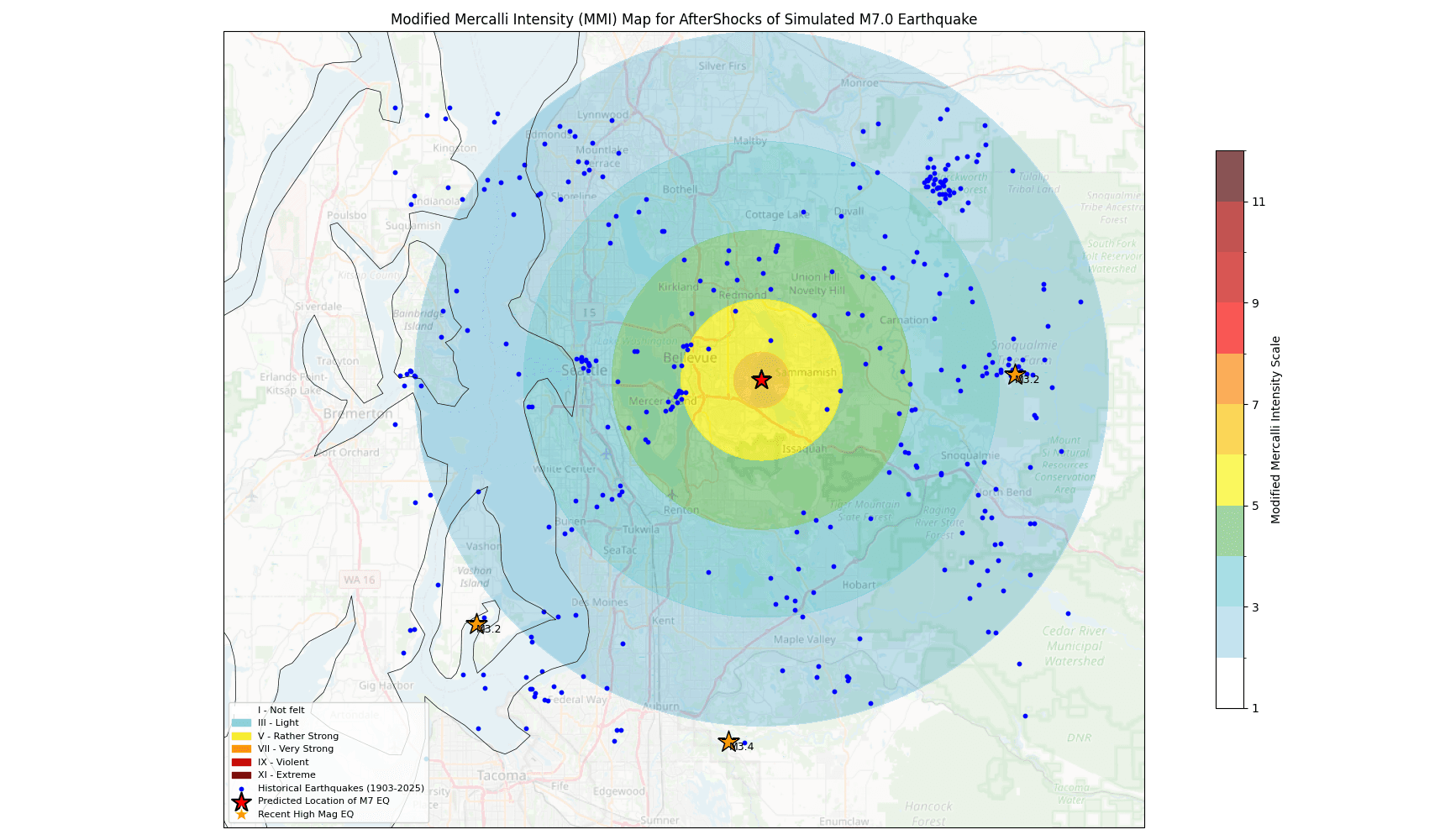
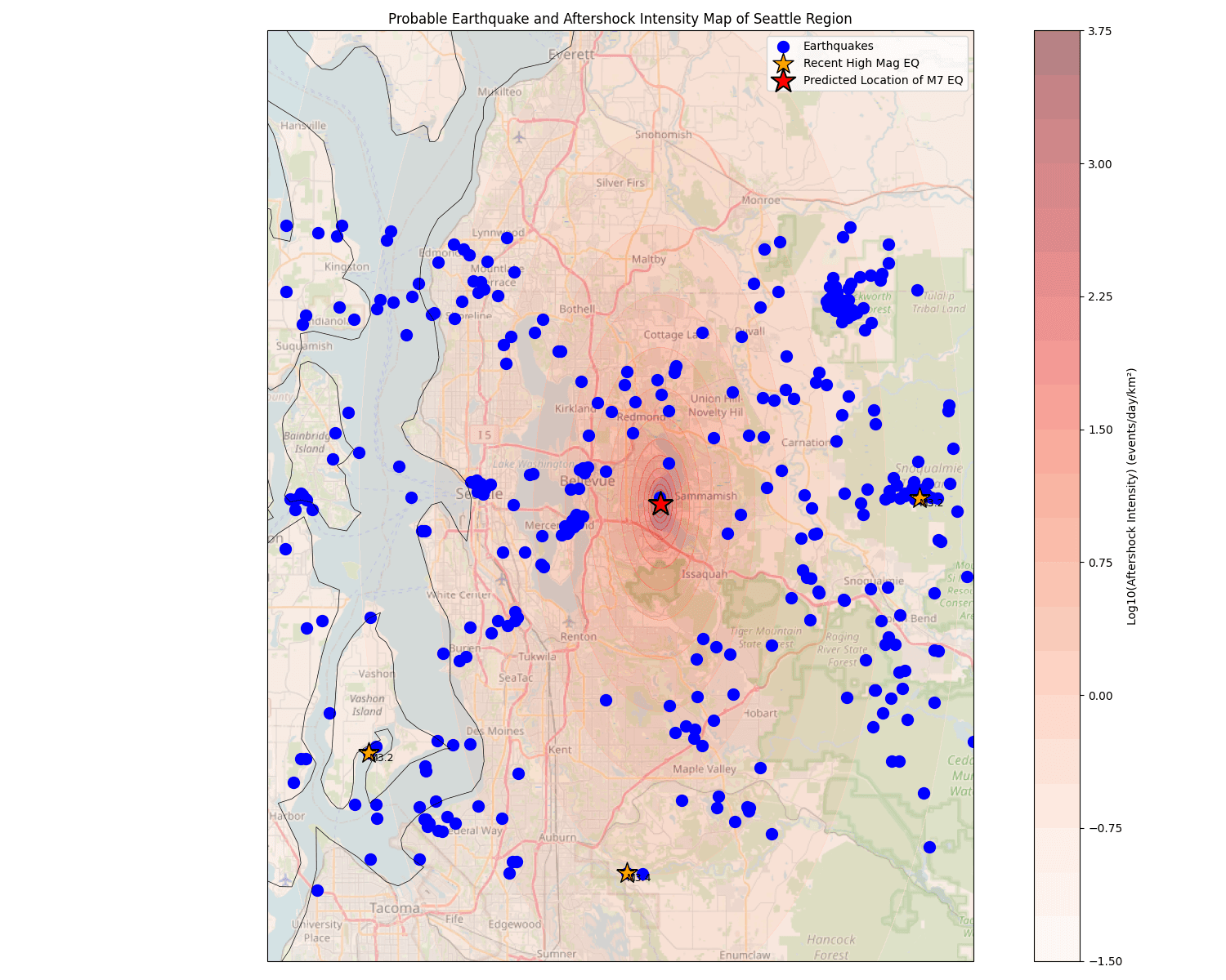
Rather than guessing at a location, we averaged the epicenter coordinates of all 2.5M+ earthquakes recorded in the area from 1900–2025 (Figure 1's data) using NumPy to produce a probable future epicenter, then used the empirical relationship Area (km²) = 10^(0.5M − 1.8) to size a predicted M7.0 impact radius around it, and overlaid that against URM building locations.
Reason:
A geographic average of real historical activity is a defensible, reproducible way to pick a hypothetical epicenter for impact modeling, instead of arbitrarily placing it downtown for dramatic effect.
Tradeoff:
Averaging treats all historical earthquakes as equally informative regardless of magnitude or recency, so the resulting point is a statistical center of past activity rather than a true seismological forecast.
ETAS modeling for aftershock intensity, converted to Modified Mercalli Intensity
We implemented an Epidemic-Type Aftershock Sequence (ETAS) model in Python/NumPy to estimate the spatial and temporal intensity of aftershocks following a simulated M7.0 event, then converted the resulting log-scale intensity into Peak Ground Acceleration and finally into the Modified Mercalli Intensity (MMI) scale so the result would be interpretable by non-scientists.
Reason:
Aftershock risk is usually reported in scientific units (PGA, log-intensity) that mean little to city planners or the public; MMI is the scale used in Seattle's own hazard planning documents, so converting to it made the output directly usable.
Tradeoff:
The conversion relies on an approximate PGA-to-MMI regression rather than region-specific attenuation data, so absolute MMI values are indicative rather than precise.
Composite hazard-per-structure overlay instead of single-factor maps
Analysis Map #2 layers liquefaction-prone areas, FEMA floodplain boundaries, and an average-hazards-per-structure grid on top of each other, rather than presenting each hazard as its own separate map.
Reason:
Liquefaction, flooding, and structural risk compound each other in the same low-lying neighborhoods (e.g. South and West Seattle) - showing them separately hides that overlap, which is exactly where mitigation resources should be prioritized.
Tradeoff:
Overlaying multiple choropleth layers makes the map denser and harder to read at a glance than a single-variable heatmap.
- Won 1st Place in Geospatial Technology at the Washington TSA State Conference, qualifying for TSA Nationals in Nashville, Tennessee.
- Compiled and cited 8 original analysis maps spanning fault lines, bridge seismic risk, liquefaction/flood overlays, unreinforced masonry buildings, emergency services, wastewater infrastructure, and aftershock modeling.
- Built Python/NumPy models (mean-epicenter estimation, ETAS aftershock intensity, PGA→MMI conversion) to move from raw historical earthquake data to an interpretable predicted-impact map.
- Concluded that a magnitude 6M+ earthquake on the Seattle Fault could cause at least $50 billion in damage, given Seattle's population (~755,000) and concentration of tech-sector employment relative to the 2001 Nisqually earthquake's ~$4 billion in damage near much-smaller Olympia.
- Overlaying independent hazard layers (faults, soil, buildings, infrastructure) surfaces compounding risk that no single-variable map reveals on its own - the danger is in the overlap, not any one layer.
- A geospatial finding is only as useful as its translation into plain guidance - our biggest actionable conclusion was as simple as "shelter in place, don't evacuate over an unstable bridge."
- Public GIS data (USGS, county open-data portals, FEMA) is fragmented across many sources with different formats, and reconciling it is most of the real work in a project like this.
- Modeling something as unpredictable as an earthquake still has value when framed honestly as a probabilistic estimate (e.g. an averaged epicenter, an ETAS aftershock model) rather than a false forecast.