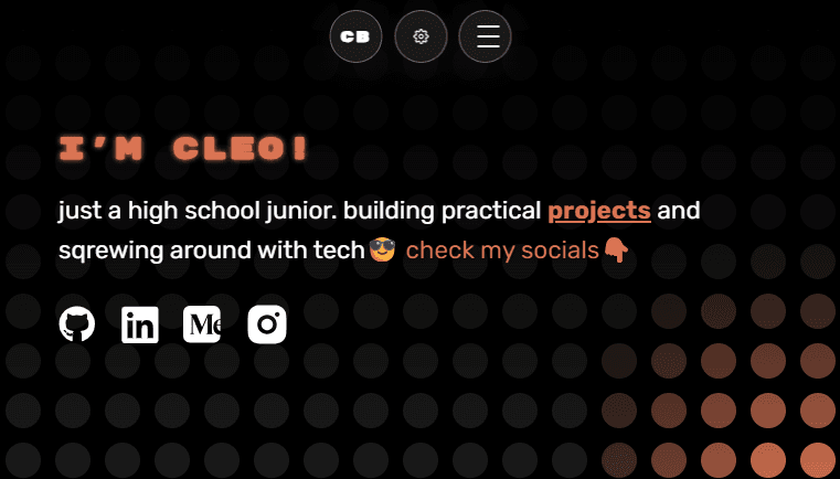
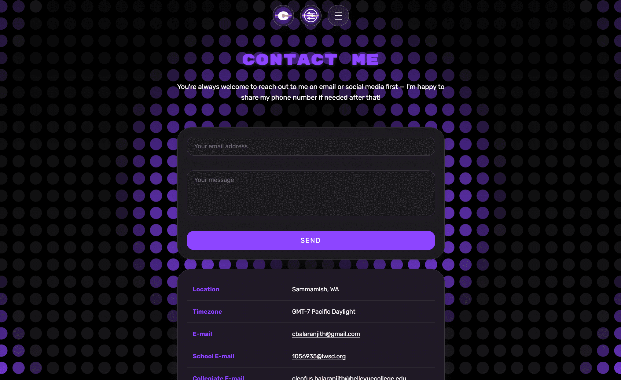
Personal Website (old) was the previous version of cleof.us - a single-page React portfolio built with Create React App, styled-components, GSAP, and Lenis. It centered on a custom LED-matrix background (LedGrid) that lit up across the page behind a hero, project highlights, about section, tech stack, and contact form, all wrapped in a branded, animated identity rather than a generic template layout.
Before this, my projects and background lived scattered across GitHub, resumes, and one-off links - there was no single, memorable place that represented me. A generic portfolio template would have solved the 'have a link to share' problem but not the 'make it feel like mine' one.
A user-configurable LED grid instead of a static hero background
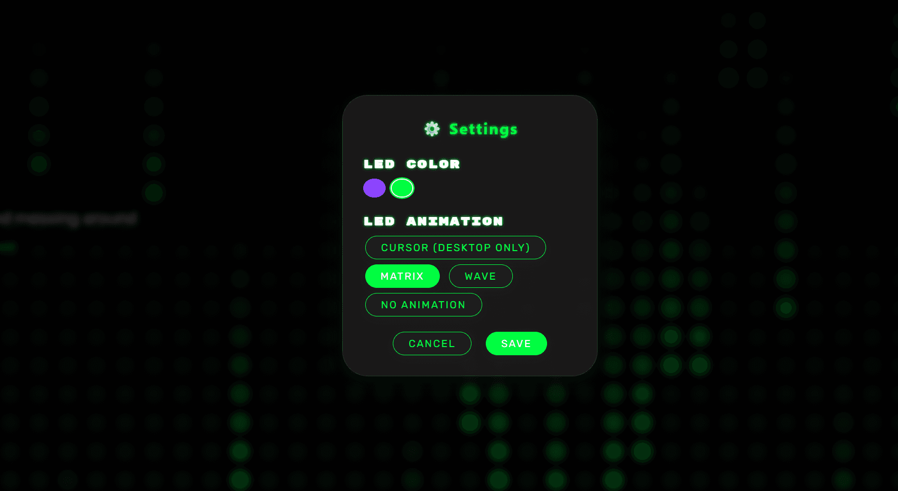
LedGrid.js rendered a full-page grid of glowing dots, and a SettingsModal let visitors themselves pick the LED color (purple or green) and animation mode - cursor-follow (desktop only), matrix rain, wave, or none - rather than baking in one fixed look.
Reason:
A static gradient or hero image is forgettable. Letting visitors tweak the background turned a decorative element into something people would actually notice and interact with.
Tradeoff:
Hand-rolling multiple animation states and a settings UI took meaningfully longer to build than dropping in a pre-made background library, and the cursor-follow mode only worked on desktop, so mobile visitors always saw a fallback animation.
styled-components, GSAP, and Lenis on top of Create React App
Theming ran through a ThemeContext and styled-components (AppContainer and friends), scroll/entry animation through GSAP, and smooth scrolling across Hero, AboutMe, ProjectGrid, TechStack, and Contact through Lenis.
Reason:
CRA doesn't ship any styling or animation opinions out of the box, and this combination got me a highly custom, animated feel without adopting a heavier design-system framework.
Tradeoff:
The CRA + styled-components + GSAP bundle is heavier and slower to iterate on than a Next.js/Tailwind stack, which became part of the motivation for the 2026 rebuild.
Shipping a DeprecationModal ahead of the actual rebuild
The old site included its own DeprecationModal component, giving visitors a heads-up that an overhaul was coming rather than letting the site quietly go stale.
Reason:
If a redesign is already planned, it's better to say so than to let visitors assume an old-looking site is just unmaintained.
Tradeoff:
A visible "this is getting replaced" notice can undercut confidence in the current version while people wait for the rebuild.
- Served as the live personal portfolio at cleof.us before being replaced by the current Next.js-based site.
- Shipped a fully custom, user-configurable LED-grid background (color + animation mode) instead of a static template hero.
- Built entirely on Create React App with styled-components, GSAP, and Lenis to hand-roll a distinctive, animated brand identity.
- A distinctive visual identity can matter more for a personal site than technical sophistication.
- Letting visitors customize a decorative element (LED color/animation) turned a background into something people would consciously engage with.
- Recognizing when a stack has run its course and choosing to rebuild, rather than continually patching it, is itself a good engineering call.